Hey all,
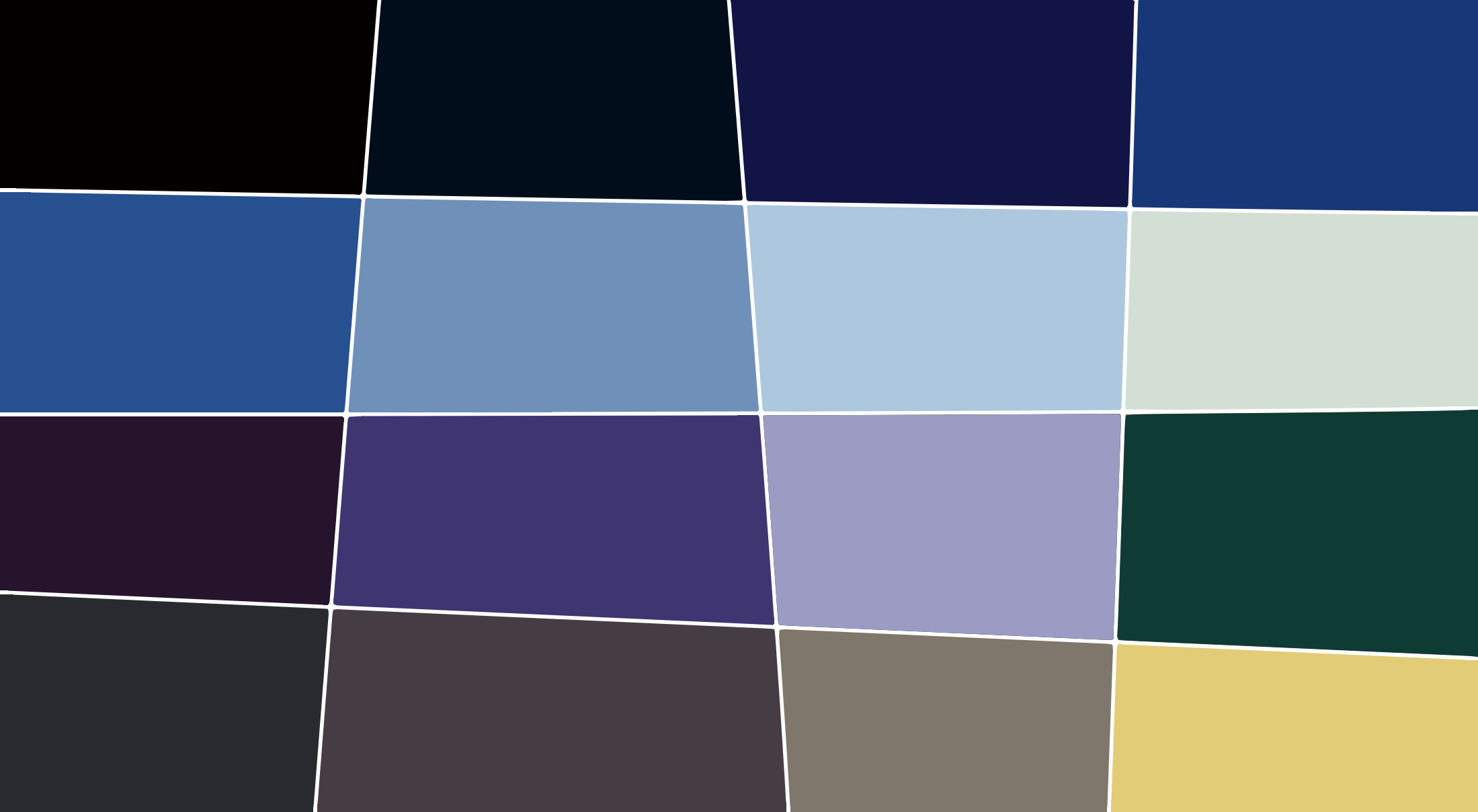
I'm becoming a bit obsessed with limited color palettes these days, loving the way they can balance out a piece while also emphasizing aspects like atmosphere, emotional tone, subject intent, etc. Anyway, I've been working on a short comic using a 16 color palette designed by pixel artist DawnBringer. Admittedly, it was intended for 16bit game development, but I think it's a very versatile palette for any medium.
I've got another piece I'm ready to get started on once I finish the comic, and figured I'd try and develope a color palette to suit the tone I want. It's heavily based off an exterior scene (by Tom O'Loughlin) from an old Warner Bros Merry Melodies short called "The Last Hungry Cat". At the moment, I'm hoping to use only the first 8 colors in this palette, but there were enough left over to make up 16 that I think could still balance out the piece nicely.

I'll admit, it's not as well thought out as DawnBringer's, (no hi-med-lo saturations, dark mixes or brightness perceptuals), but once I get started on my next piece I might try to present it a little better.
There were plenty of other scenes in The Last Hungry Cat with more color variation, but that scene in particular stuck out to me as a great example of how O'Loughlin's style (obviously inspired by Maurice Noble, but personally, I think O'Loughlin utilized perspective to a greater effect) mixed with limited colors can establish tone.
If you like this palette, by all means, feel free to use it. :-)